Safety signs are everywhere. In dangerous situations, they tell you what to do, where to go, and where to find vital equipment. In addition to the million or so exit signs you’ve seen in your life, other common life and fire safety signs include:
- Egress markers showing the way out of complicated or tall buildings
- Markers for AEDs and fire extinguishers
- Signs meant for emergency personnel
- Instructions for emergencies on airplanes, boats, and trains.
- Warnings of occupational hazards like high voltage, biohazard, etc.
Most people don’t think about safety signs until they need them. But artists and experts around the world meticulously design safety signs so that they are easily visible and understandable, especially under duress during an emergency.
International standardization makes sure that these signs are understood by everyone, even if they don’t speak the local language or can’t read at all. The International Organization for Standardization (also known as ISO; in Greek “isos” means “same”) publishes international norms for all sorts of things. Their standards for brewing tea may not be the most popular, but their list of approved safety signs is used the world over.
ISO says that good safety signs give information “that relies as little as possible on the use of words to achieve understanding.” For example, consider what went into designing fallout shelter signs during the Cold War. You may remember these signs, and you can still find them in the basements of older buildings. The Oak Ridge Associated Universities website quotes a “National Fallout Shelter Sign” fact sheet:
The sign had to meet the psychological requirements of simplicity, easy identification, retention and arresting color combination. It had to be simple enough to be easily identified by children, non-English speaking persons or others who may not be able to read. The color combination, yellow and black, is considered as the most easily identified attention getter by psychologists in the graphic arts industry.
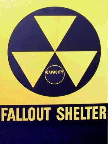
Simplicity, ease of identification, and understandability for non-English speakers are core tenants of the design of safety signs across the world. The use of pictograms rather than words is a significant design technique. Let’s look at how different signs use (or don’t use) pictograms to communicate information in emergencies.
Different ways of saying “exit”
Exit signs, of course, tell people how to get out of a building—critical knowledge in the event of an emergency. Exit signs have been designed in a variety of ways. Some designs are globally ubiquitous, but others never caught on. Let’s take a look:
Old glory—the standard American EXIT sign
America may be the land of the free, but we’re still a very traditional country. We’re happy to keep doing things just because we’ve always done them. Why don’t we join the rest of the world with the metric system? Because we’ve always used the Imperial System (also, QRFS happens to like Fahrenheit better than Celsius). US exit signs—with light-up letters saying “exit”—are similarly different than much of the world.
The American exit sign is all text—no pictograms are required by NFPA 101: Life Safety Code (2018 edition), a key model code from the National Fire Protection Association (NFPA).
Pictograms aren’t forbidden, however; section 7.10.3.2 of NFPA 101 says that with approval from the authority having jurisdiction, appropriate emblems from NFPA 170: Standard for Fire Safety and Emergency Symbols are permitted. Even so, why is NFPA seemingly unconcerned about a text-only model and the potential language barrier?
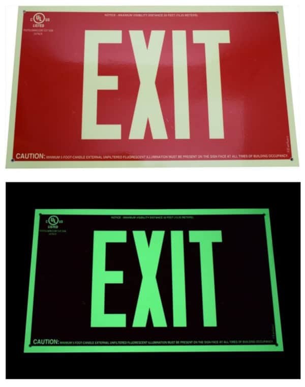
Robert Solomon, director of Building Fire Protection & Fire Protection Systems for NFPA, explained it to Slate. He said that when NFPA investigates fires, problems never arise from people not knowing what an exit sign is. Instead, he says, “When they don’t know where the exit is, it’s because there was no signage there whatsoever.” Therefore, NFPA is mainly focused on having enough visible signs.
Solomon also argues that exit signs in foreign languages aren’t a big problem because language is only part of the message. The bright red- or green-colored text, and the positioning near a door or at the end of a corridor are also communicative factors.
The DOT/AIGA exit sign was not a big hit
The US Department of Transportation (DOT) recognized issues with non-standardized signage across the United States. In 1974, they partnered with the American Institute of Graphic Arts to produce a series of pictograms to help travelers navigate their surroundings. A set of 50 symbols was completed by 1979. Many of these are effective and ubiquitous—you likely recognize their signs for “no smoking,” “rail transportation,” and “baggage claim,” among many others.
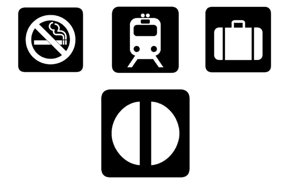
The DOT/AIGA exit sign, though, was something of a flop. Unlike most of the pictograms, this symbol does not resemble anything in particular. Maybe it’s meant to represent an opening double door. Whatever the intent, it’s hard to remember that the broken half-circle means “exit,” so it never caught on.
Ota’s “running man” exit wins out worldwide
In the late ’70s, the Japanese government held a contest to determine the country’s new exit sign. The creation by a man named Yukio Ota won the day against 3,300 others in rigorous testing of comprehension in a smoky environment. Ota’s sign (sometimes known as the “running man”) is green and white and features a stick-figure person running through a doorway.
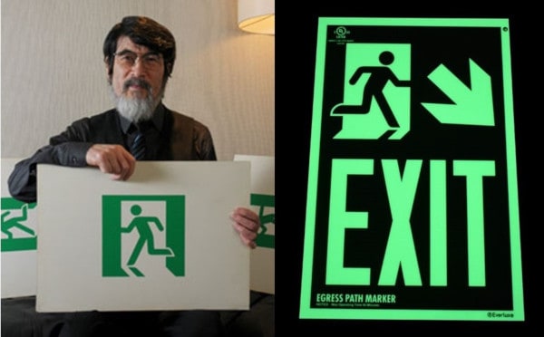
In 1980, Japan submitted Ota’s design to the ISO, which was in the process of choosing a universal exit sign. Without any collaboration or communication, Ota’s sign was remarkably similar to the emblem submitted by the Soviets (who were the favorite before Japan’s entry). Ota’s, though, won out again and became the international standard for exit signs.
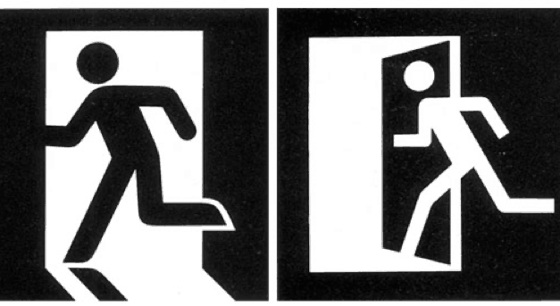
The running man sign works so well for several reasons. First, it uses no text, so there can be no language barrier. Second, the green and white color scheme—with green following the pattern of stoplights—tells evacuees, “Go this way!” rather than “Stop!” Finally, it’s just a really good pictogram. By showing a person running out a door, it clearly indicates its desired meaning. The addition of other symbols—arrows, the international symbol of access, flame symbols, and the word “exit”—only adds clarity and meaning.

Ota’s running man pictogram is so ubiquitous and useful that even organizations that don’t directly adopt it still use a derivation. A European Commission directive from 1992 established an exit sign that borrowed all the elements of the running man—green and white color scheme, running man, and doorway—and simply arranged them differently.
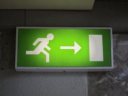
While Ota’s running man design isn’t a common feature in American exit signs, it is a core part of egress markers in certain jurisdictions and for certain (especially tall) buildings. Read more about when egress markers are required in our blog.
Life and fire safety pictograms show the way to emergency equipment
In the event of an emergency, sometimes escape isn’t the best thing to do. You may need to render aid with an AED. You might want to extinguish a small fire rather than fleeing. Or, you could need to find an emergency phone to call 911. Situations like these are tense, and locating equipment can be hard under pressure. Simple signs that use pictograms (with or without words) are a big help.
You’ll likely easily recognize these DOT and ISO symbols:
DOT signs—simple and effective, but lacking context
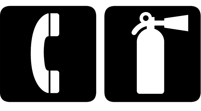
The DOT/AIGA “fire extinguisher” symbol is simple and clear. It depicts a fire extinguisher without any text. Similarly, the “telephone” pictogram is instantly recognizable. You’ve probably seen it elevators, for instance.
ISO signs combine multiple pictograms
The pictograms used by ISO for emergency equipment use some of the same essential forms as the DOT signs. The “phone” and “fire extinguisher” symbols are basically the same. But ISO pictograms, which are featured in NFPA 170, work well because they also use context.
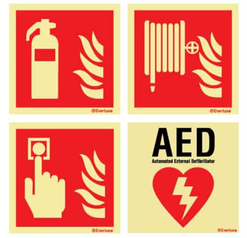
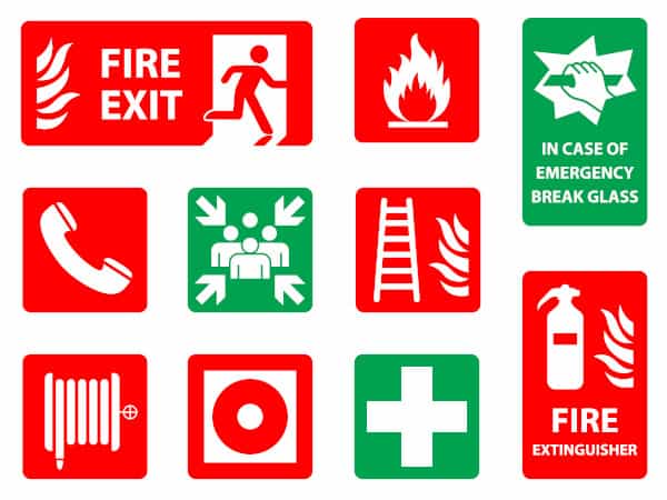
The signs for “fire extinguisher,” “fire hose,” and “call button” feature recognizable icons of their subjects. They also include a fire symbol, so it is abundantly clear that these items are for use during a blaze. The “AED” sign depends on words, but most people have never seen an automated external defibrillator—so making an icon of one is hard. But it does feature an electricity symbol over a heart that graphically tells people precisely what an AED does.
Fire safety signs for emergency responders are harder to understand—at least, for most people
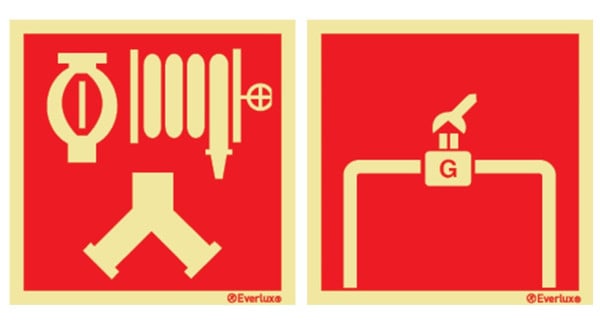
Many of our readers know what a fire department connection (FDC) looks like, but most people don’t. And they don’t need to. Certain signs and pictograms are not directed towards the general public but are instead for the use of the fire department. These icons, which are covered in NFPA 170, are recognizable to the people who need them.
Fire safety signs and pictograms save lives—and other placards clearly communicate information that makes life more efficient
Highly visible and easy-to-understand life and fire safety signs guide people during emergencies. They show the way to exits and mark the location of emergency equipment. Efforts by ISO, DOT, and NFPA have helped standardize safety signs across the US and the world. There are interesting variations—but you’ll definitely understand all of them in an emergency.
QRFS offers a variety of pictographic and text-based signs from Everlux, including equipment signs, egress path markers, and exit signs in the American text-only style and those with the ISO running man emblem. Everlux signs employ pictograms from ISO and NFPA 170. They also use photoluminescent pigment that allows them to glow in the dark, and all exit signs and egress markers are OHSA-compliant and UL-listed.
This blog was originally posted at blog.qrfs.com.



Good post on warning signs. I think electrical signs are better because they are brighter. Was good to read about safety signs post because we are in this field and was very useful.
Firstly thanks a lot for such a wonderful post.
this is a really nice post for the understanding of signs for fire and fire safety tips. This Is a very useful blog, thanks for sharing.
Thank you and thanks for reading, Chad!
A bit of an update…
There’s a code change proposal for the IBC/IFC that would officially allow the pictogram for exit signs. Unlike the currently-existing provision in NFPA 1/101, this would be allowed “by default” instead of “with individual AHJ approval”.
Full details (proposal E78-24, starts on page E227) https://www.iccsafe.org/wp-content/uploads/IBC-Egress-2024.pdf
I’m a strong supporter of this proposal. Almost every other country has done this, and it’s time for the ICC to follow suit. Currently, the “International Building Code” and “International Fire Code” are arguably a misnomer.